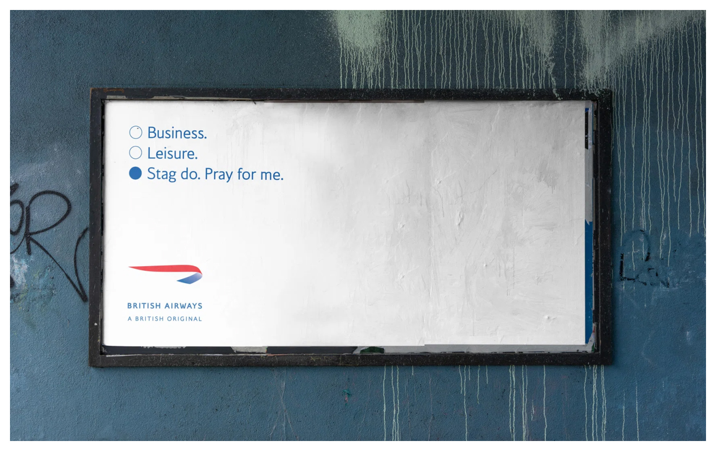
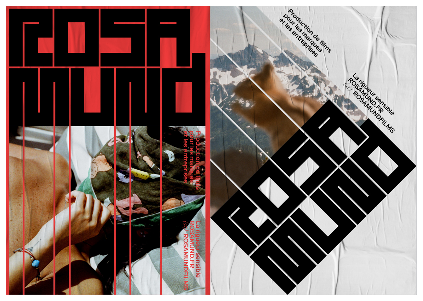
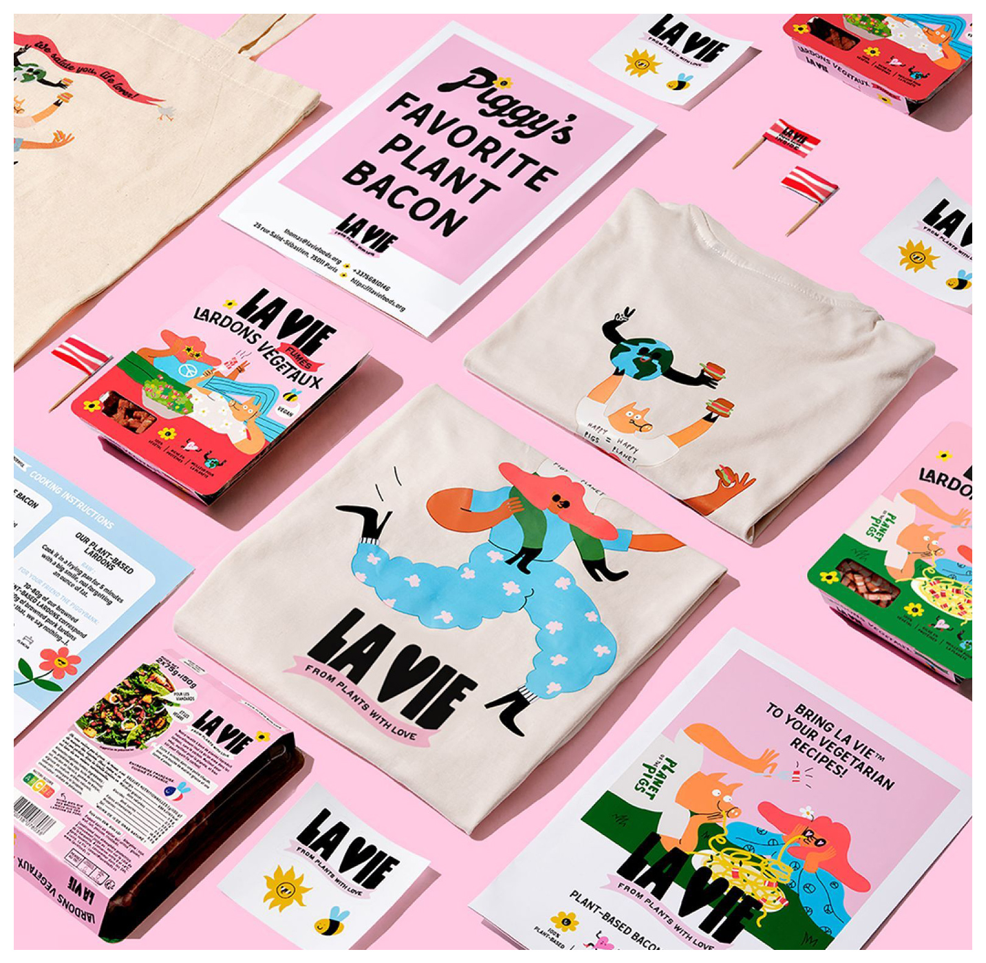
Trends & Looks for 2023

Hollie’s choices for 2023

As we are nearing towards the end of the year, we have selected several pieces of well executed design work that feature key trends in design and typography that we believe will be big in 2023. The team at The Brand Nursery will surely be taking inspiration from the work below into 2023…


Human storytelling

A British Original campaign for BA. Limitless executions of relatable reasons to travel and clever timelessly modern art direction.


Retrofuturism

Nostalgia-driven typefaces and dynamic retro colour swatches.


Pantone Color Institute

Fashion colour trends for Autumn/Winter 2022/2023


Mixing the old with the new

Giving Shakespeare a contemporary edge by mixing historical and modern type.


Pasta Dreams: a taste of the 1970’s

Inspired by boiling pasta-like shapes and more than a hint of of nostalgia, the colour palette adds to the 1970’s retro theme. A nod to a time where imaginations were running wild with thoughts of what the future might look like. Collaged dream-scapes made up of ingredients and shapes give the brand a sense of place.


Weezy: standing out in a busy market

Inspired by nostalgic memories of local grocery cornershops with a friendly and entertaining typestyle and eye-catching retail shapes.


A fallback to the comforting past

Symbol, a soulful and handcrafted furniture brand. Designers, fatigued by bright/squishy/meta/etc., will embrace familiar and even historical design over the trends we saw this year.


Slightly chaotic

A more-is-more approach to integrating multiple design styles together in a way that acknowledges the past by yanking it forward.


Noodles: it’s the future

There’s a new generation of consumers out there who buy into food innovation now more than ever. Totally recyclable and sustainable formats, a look that’s full of colour and character and genuinely entertaining.


Clean and engaging

Intriguing imagery and everyday colloquial language make for a clean and striking campaign across all platforms.


Post-Covid drinking preferences

Steering clear of traditional heritage/pastiche, with a cleaner more contemporary take on a spirits brand.


Graphic shapes

Bold graphic shapes, simple typography and natural, tactile substrates.

Font Trends


Accessibility for all

Rebrand for Understood, a non-profit organisation for those who learn or think differently, making certain characters more distinguishable for readers and improving readability.


Futura reimagined

A reimagining of the classic font Futura as a monospaced typewriter font.


Bold geometric

Clean, contemporary and easy to read against a backdrop of colour.


Contemporary elegance

This modern colour palette and elegant serif typeface combine to create a cool, contemporary feel.