The Simpler Life
If the last six months has taught us anything, it’s not to take things for granted and that there are many virtues to living a simpler life.
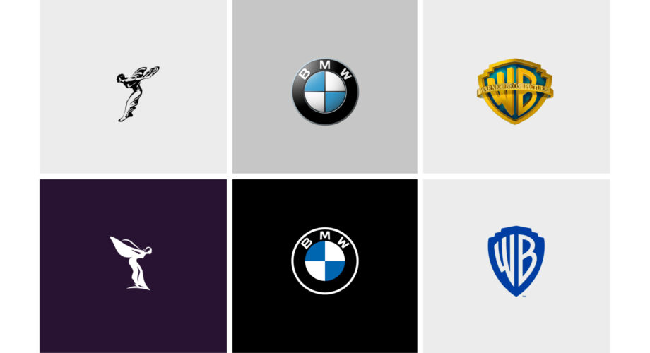
Brands and their identities have seemingly stolen the march on this thinking as in the last year or so we have seen an acceleration of global brands revealing their new identities. Warner Brothers, Go Daddy, Durex, VW and BMW to name but a few.
Between them there seems to be one common theme – a simpler, more minimalistic, stripped back two-dimensional design idea.
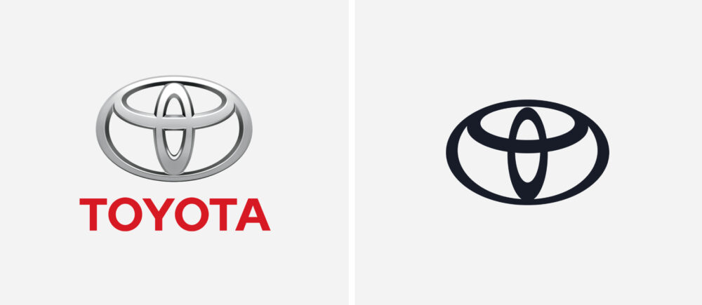
Toyota is one of the more recent additions to the ever growing list and has been so bold as to remove the brand name completely. A step too far? Or is it that the shape, form and colour of the Toyota logo marque is enough to make it visible, understandable and recognisable on its own?

So why have brands chosen a more stripped back approach and what has been their motivation behind this decision?
There’s one simple answer to this – the digital environment, in which we spend an average of 50 days a year on our smartphones looking at and engaging with brands.
We can go back to 2013 with Apple’s iOS update when their application icons went ‘flat’. This notoriously rocked the world of UX and caused a knock-on effect with a lot of confusion (what is clickable – what is not). And who can forget Instagram’s gradient 2D logo that they revealed back in 2016. At the time this caused uproar within the die-hard Instagram community with many users divided over the new minimalistic 2D design, but now it would seem that Instagram were simply ahead of the curve by getting fit for the digital world.

Three reasons why we think less is more…
1. The days of designers having to comprehensively understand the software necessary to produce complex 3D logos is now not a necessity. And need we mention the hours saved on having to produce one…
2. We now need not worry about how a convoluted identity will work across different platforms as having a multitude of different sizes is (mostly) a thing of the past. In other words, the logo styles of the 90’s with cast metal and chrome-effect realism have been scrapped as digital communication pulls rank, especially on mobile screens
3. The simplicity of these designs makes it easier for us to take them in, especially when attention-spans are at an all-time low. Some would say these stripped-back identities makes the brand easier to recognise without the unnecessary embellishments. This works better online as it improves the user experience and eliminates distraction
Although it would appear that the trend to simplify is here to stay, it is also very much a sign of the digital times we are living in.
Brands are embracing the digital era. They have come to understand that chrome-effect 3D designs do not translate across a myriad of different digital platforms and let’s face it, online is where we engage with brands more than anywhere else.
This won’t be the last we’ll see of brands moving towards a more simplistic approach. If anything, this is just the beginning.
As the digital world continues to evolve with further technological advances, it will be interesting to see just exactly what the future holds as brands continue to move with the times.
So for now simple is better but we suspect once AR, and the next generation of digital visualisation comes around the corner, big ‘spinny’ chrome rendered logos may be the next big thing (again).
Now where’s that hover-bike they promised me 50 years ago…?
Words by Hollie Stothard
